Adidas has taken another step towards sustainability with this additional feature
80 Hours
4 Weeks
Figma, Zoom
Adding an innovative addition involving the refurbishment of used Adidas items, while aligning with the brand’s commitment to sustainability. By offering these refurbished products for resale, Adidas not only reduces waste but also provides consumers with unique and environmentally friendly options, further reinforcing its dedication to both style and sustainability.
Overview
Qualitative Research
Global athleticwear giant Adidas leverages its iconic image and innovative approach to connect with audiences worldwide. Their seamless blend of athletic performance and fashion extends to their online presence, creating a digital experience that reflects their brand values.
Problem
This case study began with two potential problem areas. Project parameters, however, dictated a single focus. Therefore, the research phase became instrumental in pinpointing the most compelling issue to dive into
Potential Problem 1 – Slow Delivery Options in South Korea
Within S.Korea, expediated delivery is crucially important to buyers. However, the Adidas website does not provide options for deliveries under 2-days.
Potential Solution 1 – Same-Day Delivery Options
To cater to customer demand for faster deliveries, this feature may integrate with existing online ordering and allow users to choose from faster delivery options offering estimated delivery windows of 2-8 hours.
Potential Problem 2 – Slow Delivery Options in South Korea
While Adidas proudly claims its status as a sustainable company, their commitment isn’t readily apparent to consumers. Beyond a brief statement on their website, there’s a lack of tangible evidence whether they are sustainable or not.
Potential Solution 2 – Offer Refurbished Items
Adidas REBORN offers customers a chance to shop for gently-used clothing, shoes, and accessories. These items are carefully inspected, refurbished, and certified “as good as new” by Adidas. This program promotes sustainability by extending the life cycle of products.
RESEARCH
METHODOLOGY
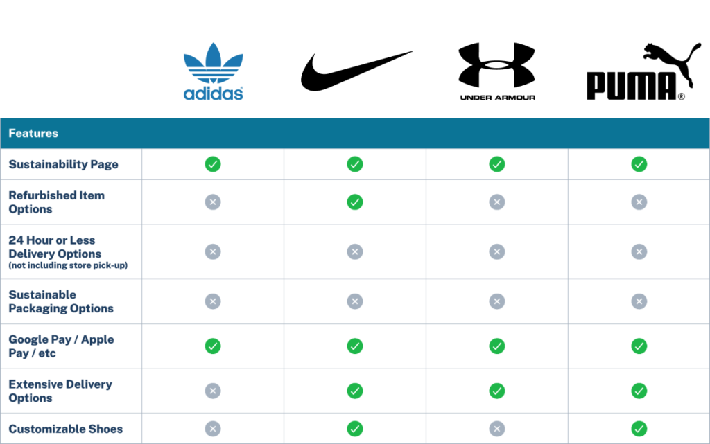
I initiated research centered on conducting a competitive analysis of Adidas’ rivals. Initial findings clearly indicate that Adidas lags behind its competitors in terms of both delivery options and refurbished selections. This provides me with a clear starting point for the next step, where I’ll use this information to determine whether to focus on enhancing delivery options or refurbishment features on the Adidas website.
User Interview
I conducted interviews with four participants, consisting of two Korean nationals and two Americans. The interview topics included (1) online shopping, (2) environmental awareness in the fashion industry, (3) willingness to explore online secondhand shopping, and their (4) overall opinions of prominent brand names attempting to enter the market for refurbished goods.
Essential items for household or office use
Unique purchases for creating a distinct style
Unaware of fashion industry’s environmental impact
Negatively impacts the environment
Willing to purchase second-hand items if the name brand provides a high-quality guarantee
Values eco-friendly and cost-effective products
Reluctance to purchase second-hand items
Affinity mapping
Following the interviews, I meticulously reviewed the recordings, identifying significant insights to discern the aspects of the questions that deeply resonated with the participants. Additionally, I categorized their responses to develop a clearer understanding of their focal points.
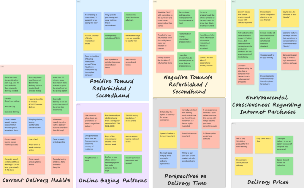
INTERJECTING THOUGHT: At this juncture, I made the decision to concentrate on introducing an additional feature for refurbishment on Adidas’ website. This decision stems from two primary factors.
Firstly, although the data gathered from user interviews may seem relatively balanced, I noticed a greater level of enthusiasm and interest in the participants’ voices when discussing the concept of Adidas refurbishments.
Secondly, from Adidas’ standpoint, there is no indication to suggest that the company would refrain from offering expedited delivery options if they were feasible. Thus, the responsibility for a faster delivery service doesn’t solely lie with Adidas, but rather with the service itself.
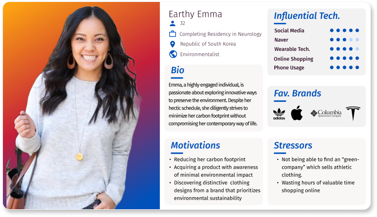
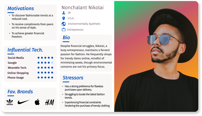
Personas
I developed two personas to provide a clear understanding of the target audience, guiding design decisions, enhancing user experiences, and ultimately leading to more effective and user-centered solutions.
Design
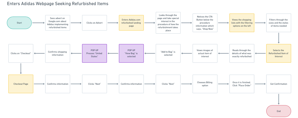
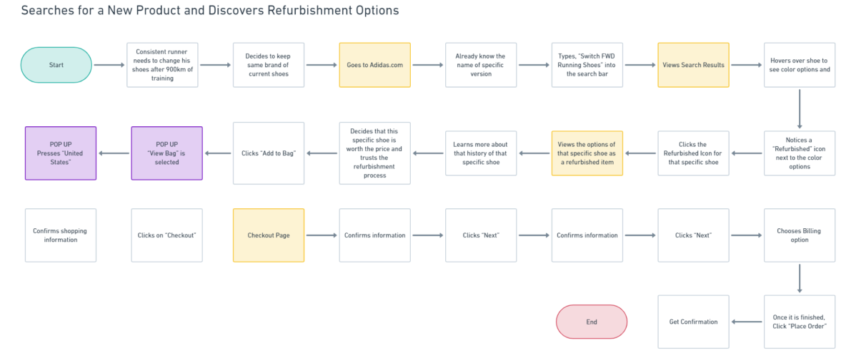
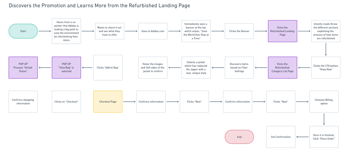
Flows
I designed flows to with four specific goals in mind:
lo-fi Sketches
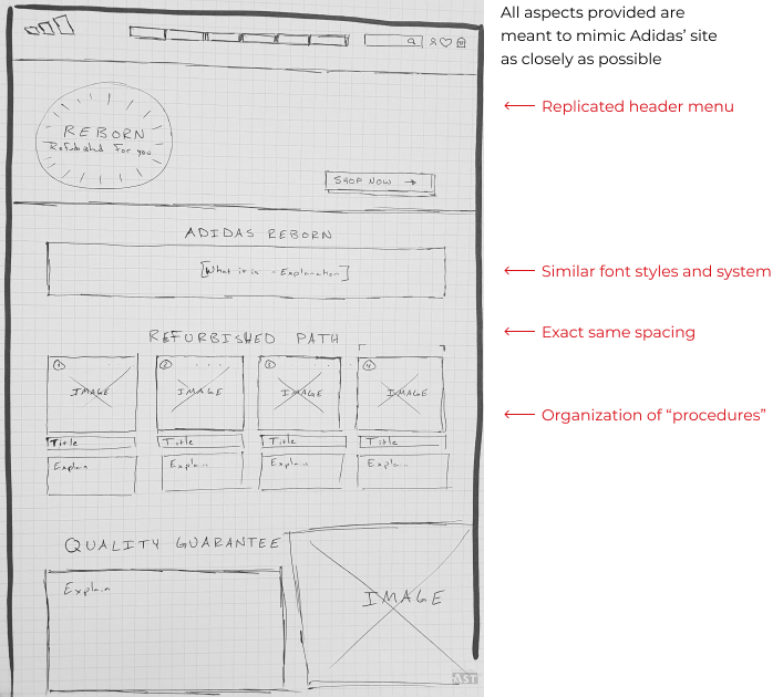
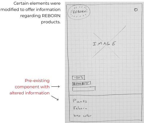
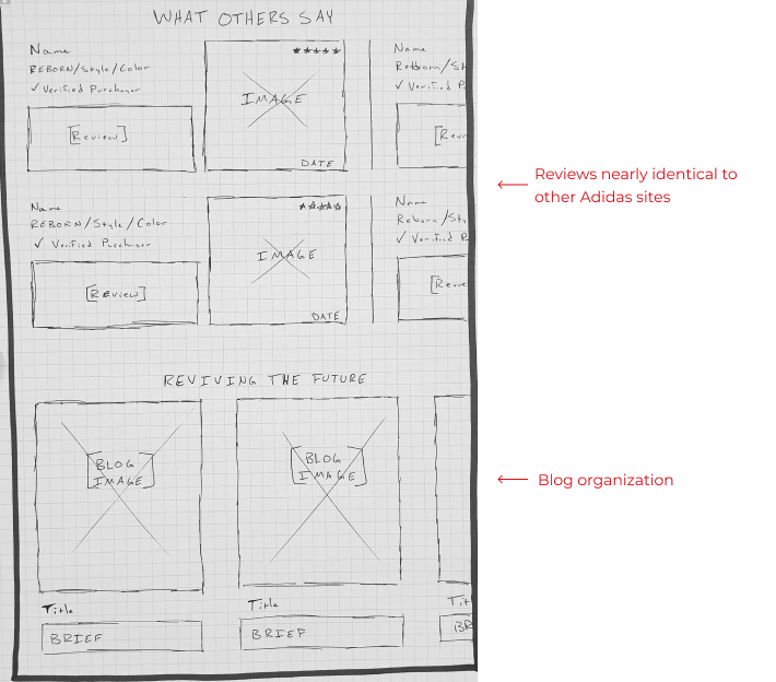
As the aim of this case study was to integrate a new feature into an existing website, a significant portion of the design and setup had already been completed. Nonetheless, there were specific essential components that required development to effectively communicate and highlight the functionality of the feature itself.
A full webpage devoted to detailing the explanation, background, and process involved in the transformation of a used product into its revitalized state as “REBORN.”
Prototypes
hi-fi website
I needed to modify the existing Adidas website in various areas without being noticable.
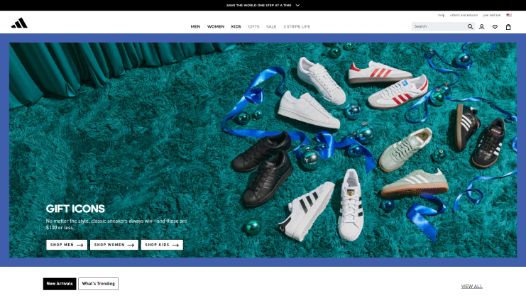
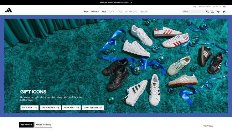
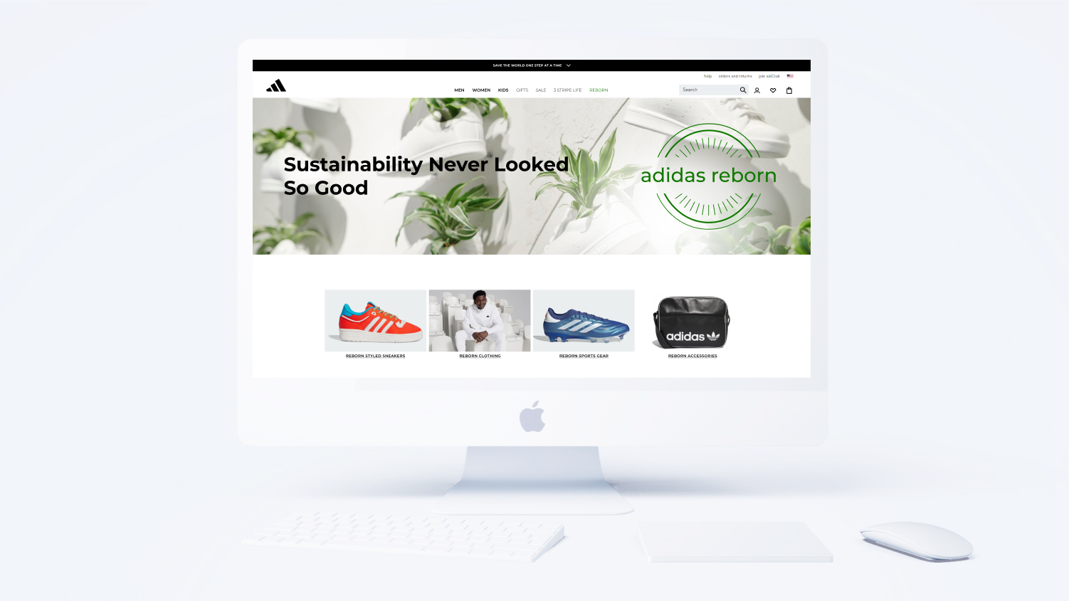
Incorporating a direct call-to-action button in the Hero Image was my intention, enabling users to swiftly navigate to their preferred destination. Additionally, a green “Reborn” button was introduced in the top menu bar, providing users with the opportunity to explore further details about the product line and its refurbishment process.

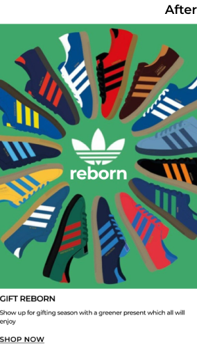
Various cards (LEFT) within the site were replaced with REBORN adverts (RIGHT) in hopes to catch the eyes of the users. Themes, styles, fonts, and colors were deliberately selected to not only emulate the replaced items but also blend seamlessly with the adjacent cards/components.
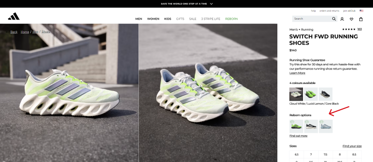
For those users who arrive to the Adidas website with intent of buying brand-new items, an option appears as a small notice if that same item is available as REBORN.
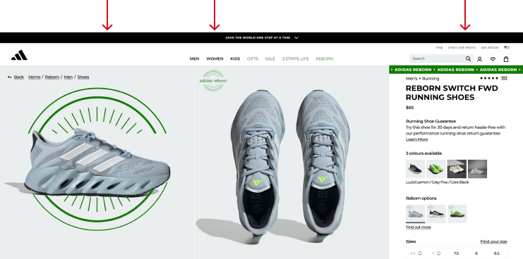
It’s essential that when users select a REBORN item and view it, they can readily distinguish it from brand-new items. To achieve this, the “REBORN STAMP” has been strategically positioned in prominent areas, along with a scrolling banner on the top right.
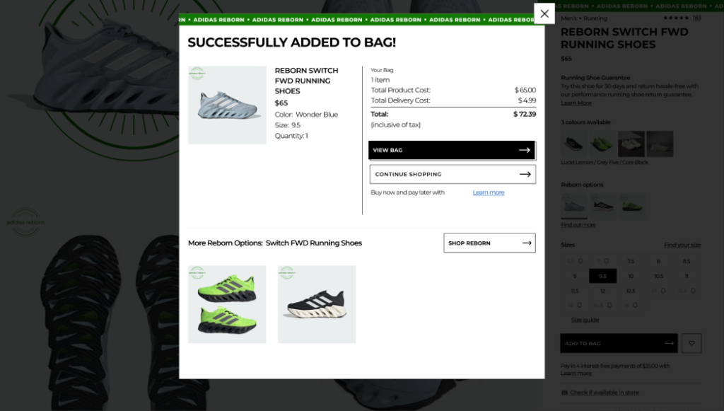
According to user interviews, participants expressed a desire for reassurance regarding their purchases. Consequently, “REBORN stamps” and the animated banner were incorporated at the top of the pop-up when adding REBORN items to their shopping bags for purchases.
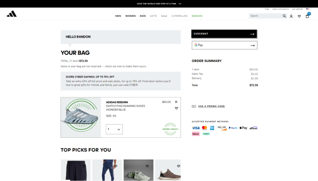
As a third and final reminder, a REBORN STAMP has been utilized (twice) to confirm users’ purchases.
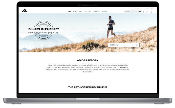
An information page dedicated to REBORN was necessary to educate users about essential details regarding what exactly REBORN entails and how it is processed.
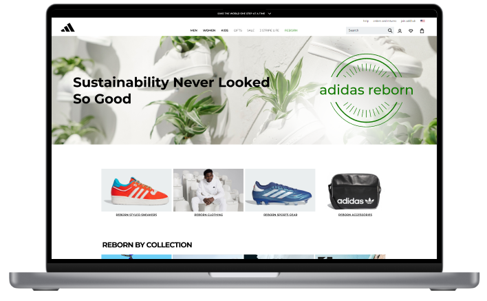
A dedicated page showcasing available REBORN items was also developed for users who prefer to exclusively shop for sustainably refurbished products.

The cards within the search functionalities were required to mirror Adidas’ design while also displaying price variations for REBORN items compared to their original prices.
Test
methodology
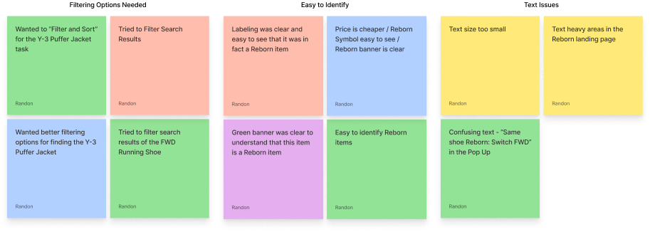
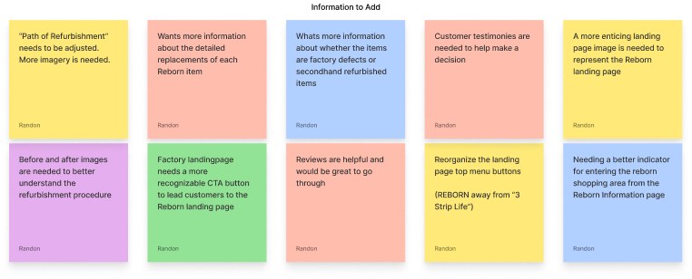
This usability testing process involved five participants and utilized Zoom for remote testing sessions. Following the testing, recordings were reviewed and summarized to extract key findings. These findings were then categorized using a feedback grid, which organized them by factors such as tasks, problematic issues, and improvements.
RESEARCH GOALS
Four primary reasons to conduct a usability test:
USER TASKS
The participants were asked to:
Usability Test Results
The unanimous consensus among participants was that they could effortlessly discern new products among the REBORN items.
All participants articulated that they perceived the navigation and procedural sequence within the site as intuitive.
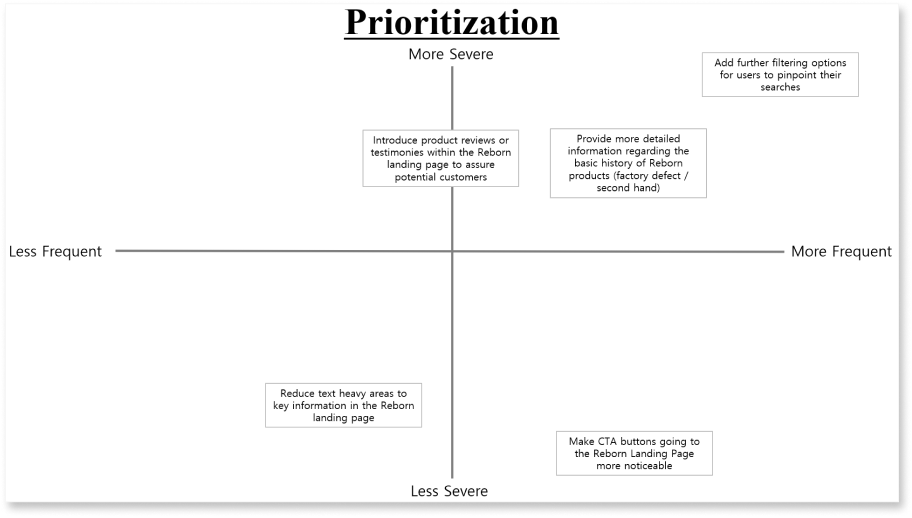
In tasks aimed at finding specific items, 60% of the participants expressed a desire to further refine search results.
Iterations
Based on the data and feedback gathered during usability testing, I integrated and adjusted specific elements within my designs to enhance user experience and sharpen its intended purpose.
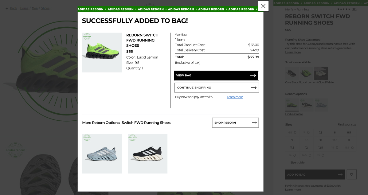
Added Element: The banner confirming to the tester that they were indeed viewing Adidas Reborn products underwent an enhancement. It is now a dynamic, moving banner designed to capture the user’s attention and aid in focus. This concept drew inspiration from Adidas Singapore and their “End of Year” discount banner.

Added Element: The majority of the participants expressed curiosity about the history of the REBORN products. As a solution, a “Quality Assurance” reminder has been seamlessly integrated into the detail dropdown menu for each Reborn product.
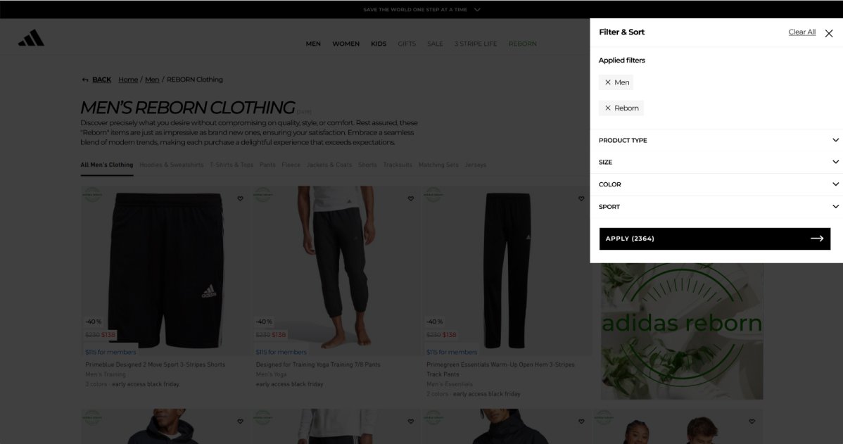
Added Element: Every participant attempted to use the “Filter & Sort” feature during testing. Responding to this unanimous engagement, an added filter has been added, enabling users (if wanting) to exclude the REBORN filter and search exclusively for factory-made, new products.
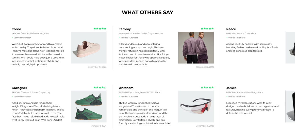
Added Element: While every participant appreciated the Reborn concept, they also sought reassurance through previous buyer testimonials or reviews. As a result, a dedicated section has been introduced to provide buyers with valuable insights, empowering them to make informed choices when selecting a REBORN product.
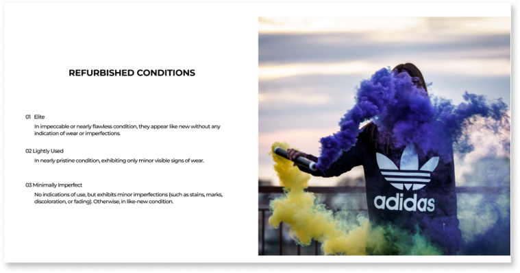
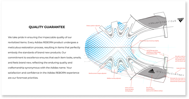
Changed Element: Initially, the plan was to implement a refurbished condition level. While this concept resonated with some participants, it was deemed impractical from a designer’s standpoint. Consequently, an emphatic quality assurance message was crafted to assure buyers that all Adidas products, whether new or reborn, adhere to the highest standards of quality.

“It took me a long time to notice the “REBORN” button at the top of the page. I think it needs to stand out more or something”
– Participant #2

Changed Element: The “REBORN” button’s color has been changed to green, distinguishing it from other menu options. Additionally, an extra button has been added to the Hero page for enhanced visibility, ensuring users can locate it effortlessly.
final product
This high-fidelity prototype reflects the final stage of the design process, integrating all feedback and refinements
REFLECTION
What I learned
User testing exposed blind spots in the design process.
Despite focusing on efficiency, usability testing revealed crucial details that were initially overlooked. The consistent feedback from participants emphasized the importance of user-centered design to identify potential problems for users.
Learning Through Exploration.
Despite initial doubts, opting for user interviews to validate the refurbishment path left me immensely satisfied.
The design successfully embodied the Adidas brand.
User feedback reinforced this by praising the added features as seamlessly aligning with the Adidas brand identity. This positive response validates the decision to integrate those design elements.
MY OTHER PROJECTS
Copyright © 2024 All Rights Reserved . Powered By Nerdzilla Tech