A responsive website tailored to user needs, consolidating various platforms into a unified experience.
5 weeks
Figma, Zoom
A local studio, aimed to create a user-friendly and centralized online hub for their current and future clients.

Aube Pilates is a dedicated studio offering personalized Pilates instruction to help clients improve their daily lives. Founded by YooJin, a seasoned instructor with over 10 years of experience, Aube Pilates prioritizes mindful movement and targeted exercises for practical applications.
Despite actively engaging on social media platforms like Instagram and YouTube, and maintaining a popular blog on Naver, Aube Pilates’ online presence lacks a central hub. This fragmented approach makes it difficult for potential clients to discover all the valuable content they offer.
A new user-friendly website will bridge the gap in Aube Pilates’ online presence. Serving as a central hub, it will:
Design Process
I led the UX/UI design for this project, crafting both strategy and visuals.

User Interviews
Competitive Analysis

Personas

User Flows
Task Flows

Wireframes
Visual Design

Usability Testing
Implementing Feedback
Qualitative Research
A two-phase interview process informed the design of the Aube Pilates website. First, in-depth discussions with the studio owner revealed her vision and core needs. Second, interviews with potential clients explored their expectations. This combined data ensured the website aligns with both the owner’s goals and user needs.
Interview Questions
Key insights derived from the interviews
Location was king: All participants prioritized convenient locations when choosing a workout venue.
Data Privacy: While 25% of participants preferred limited data sharing (name and email only), the remaining 75% were comfortable providing necessary details during registration at a new gym.
Booking Woes: Every participant had experienced issues with online booking systems. Half specifically mentioned frustrations with confusing third-party platforms, especially when errors arose.
Seeking Simplicity: Streamlined booking processes were a top priority for all participants. Easy cancellation and modification options were also highly desired.
Flows
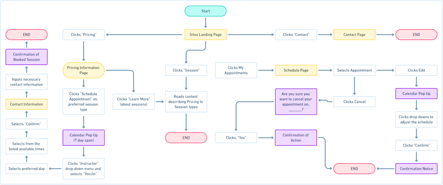
Through in-depth user interviews, I gained valuable insights that shaped the website’s general user flow and task flows, prioritizing essential functionalities. Analyzing this data alongside learnings from the competitive analysis allowed me to streamline the user experience.


Mid-Fidelity
Starting with low-fidelity prototypes, I established a clear information hierarchy for the studio owner’s review. Their feedback then guided the development of high-fidelity prototypes, which offered a more realistic feel of the final website.
Hi-Fidelity
Based on user interviews, it’s apparent that a significant majority of users tend to utilize their mobile phones for searching, discovering, and gathering information about exercising facilities. Consequently, the website has been adapted to adopt a responsive design model.
Usability Testing
To assess the user experience of the Pilates studio website, I conducted remote usability testing sessions with 5 participants residing in South Korea. These participants had prior experience joining either a Pilates studio or registering for a gym online.
Streamline access to essential business information and online resources within a centralized hub.
Streamline access to essential business information and online resources within a centralized hub.
Implement a user-friendly scheduling system for convenient appointment booking, viewing, modification, and cancellation.
During usability testing, participants consistently commended the website’s professional and sophisticated design. This positive user perception regarding the website’s perceived quality directly aligned with the studio owner’s aspirations for a luxurious appearance.
Initial usability testing revealed that some participants missed the homepage’s scrolling functionality. This might be attributed to the first prototype design using a limited viewport that appeared complete, giving the impression it wasn’t scrollable.
The social media section on the homepage overwhelmed users. Multiple participants commented on the large size of images and mobile frames, which dominated the screen and detracted from other content.
“The scheduling page made it incredibly clear how many Pilates sessions I had remaining in my package. It was easy to see what I had used and what was left, without any confusion.”
ITERATION #2
A few changes were needed for the Social Media section of the homepage
To evoke a resemblance to the social media platform without direct imitation, a complete redesign of the section image layout was necessary. This approach aimed for subtle recognition by users, independent of the top buttons.
Using skeuomorphic buttons ultimately didn’t fit with the general vibe of the site and therefore needed to be redesigned.
ITERATION #5
Clearer path to instructor bios
During usability testing, most participants found the instructors’ images and basic information. However, they desired more in-depth details and attempted to click on names, titles, and images. Unfortunately, there was no clear way to access this additional information, leaving them frustrated.
REFLECTION
Outcomes
The launch of this website design has been postponed due to time and engineering limitations. However, I maintain regular communication with the owner of Aube Pilates and intend to persist in refining the site designs until we achieve a fully functional website. The owner expressed excitement at the prospect of seeing her ideas materialize and her company’s website come together, enabling her clients to access all online content conveniently in one central location.
If I had more time
Secondary research is imperative at this juncture. I’m eager to collect additional data from a broader audience to more accurately identify any missing elements, such as the instructor bios.
MY OTHER PROJECTS
Copyright © 2024 All Rights Reserved . Powered By Nerdzilla Tech