Connecting you with community, uncovering local routes, and providing comprehensive insights into your bicycle
all through an intuitive app experience

5 weeks
Figma, Zoom
Your gateway to a vibrant cycling community, exciting discoveries, and confident rides in South Korea.
South Korea: Is Geared Up
South Korea’s cycling scene is booming! Scenic trails, thriving clubs, and city bike-sharing programs attract riders of all stripes. But planning rides? Not so smooth. Existing apps lack details crucial for cyclists, like hidden gems, bike shops, and safety tips. New riders struggle to find clear info on cycling etiquette and regulations. Enter KorCycle – the app that bridges the gap for a safer, more informed cycling experience in Korea.

User Interviews
User Research
Compeitor Analysis

Affinity Mapping
Personas
Empathy Mapping

User Flows
Task Flows

Mid - Hi Fidelity

Usability Testing
Iterate
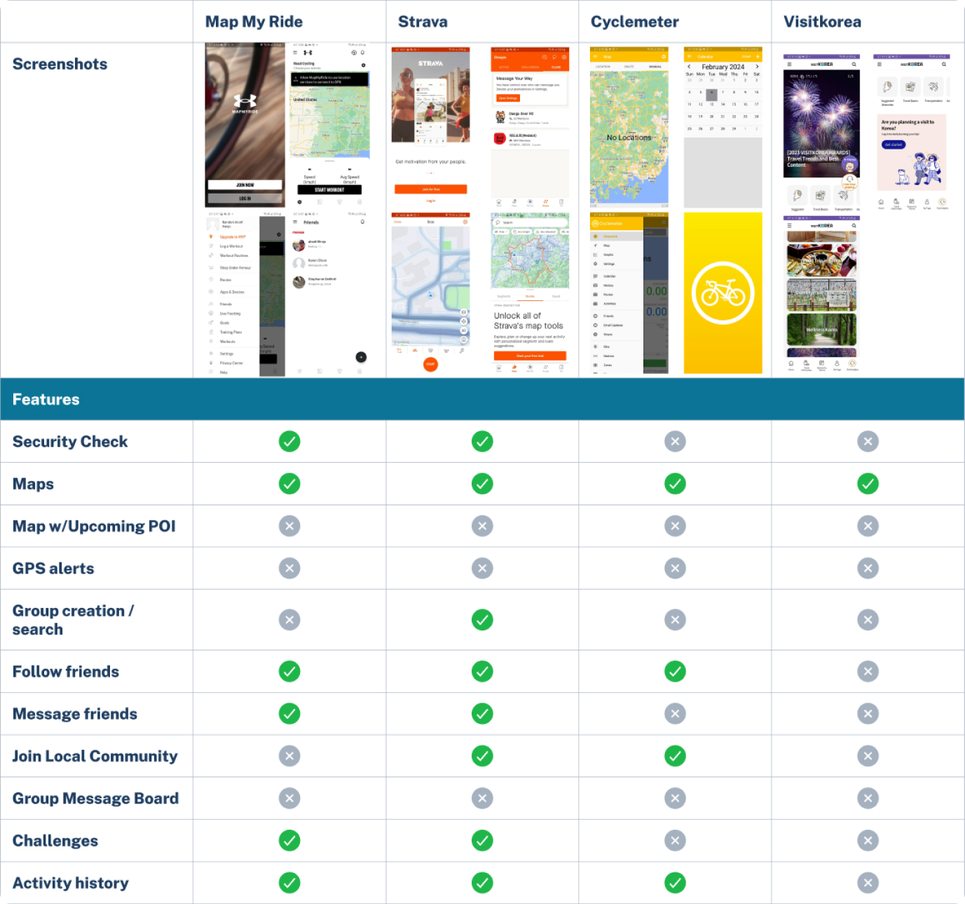
Understanding the competition and user needs through a competitive analysis is key. This helped us:
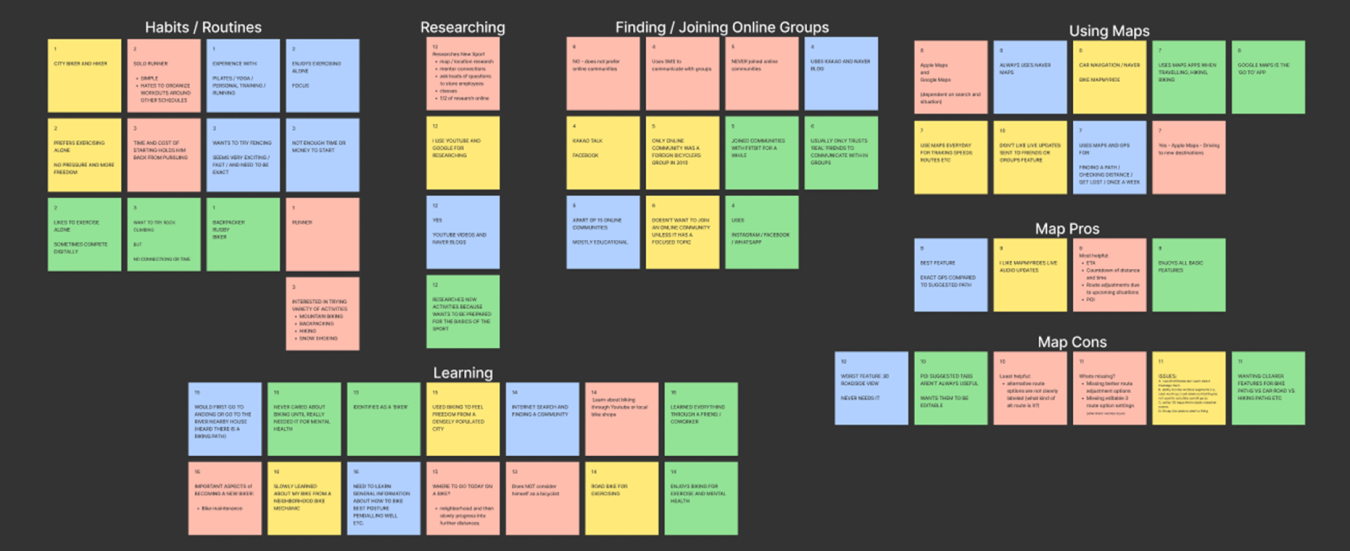
Gaining a deep understanding of user needs, we conducted interviews with 5 potential users. We explored their daily routines, exercise preferences, current tracking methods, and the features they wish to see in ideal tracker applications. The valuable insights gathered were then categorized for further analysis.
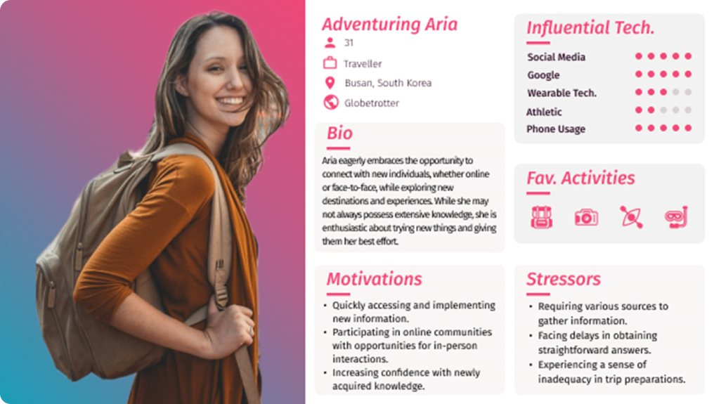
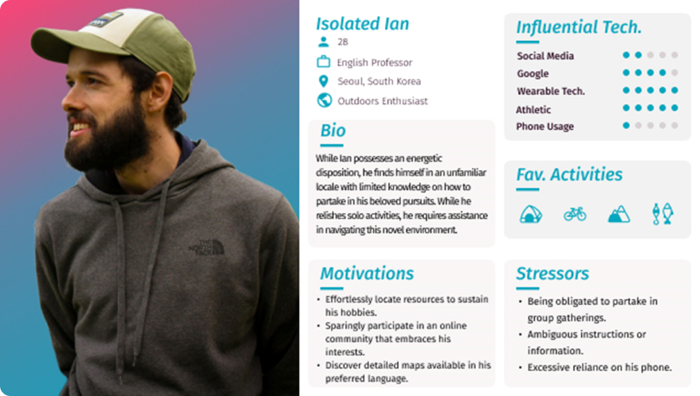
Leveraging insights from user interviews, the team developed personas – detailed profiles representing target users. These personas functioned as the guiding principle throughout the project, ensuring every design decision aligned with user needs and expectations. This focus on user-centered design aimed to maximize user satisfaction, usability, and ultimately, the project’s success.
The User Flow and Task Flows (3) were used to map out how users would ideally interact with the design. This has helped to ensure a smooth and intuitive experience by:
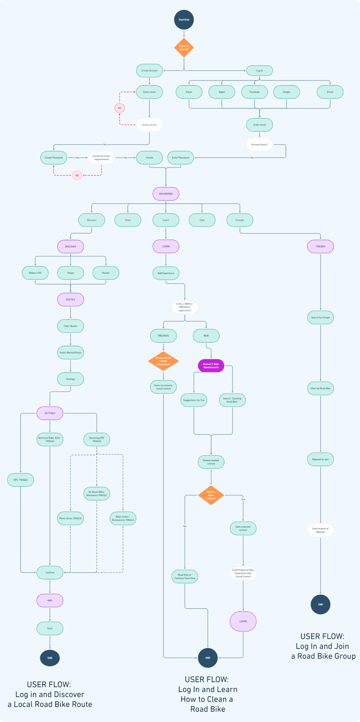



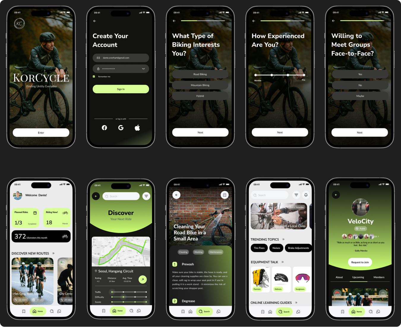
From the insights gathered in the research interviews, participants emphasized the importance of a personalized exercising experience. Consequently, the objective of incorporating onboarding questions is to precisely identify users’ preferences and reduce the presence of irrelevant information about biking activities that do not align with their interests.
Participants in the interviews emphasized the importance of learning about bicycles, discovering local groups to join, exploring new local paths, and acquiring knowledge about appropriate equipment. As a result, these specific aspects were given focused attention.


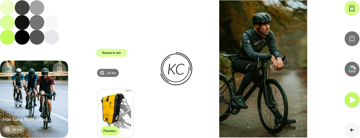
The selection of green highlights symbolizes nature, reflecting the preference of most participants who use tracking applications during outdoor exercises rather than at indoor gyms. The font typeface and button size/format were chosen for simplicity and ease of visibility, considering that users may be in motion while using the application. Additionally, the logo is designed to convey circular motion, resembling that of a bicycle wheel.
By creating a high-fidelity model, I could thoroughly test the KorCycle app’s user interface and interaction before any actual development began. This identified potential issues early on, which ultimately saved time in the end.

Task Success Rate: This measures the proportion of participants who successfully complete assigned tasks.

Error Identification: This focuses on minimizing the number of errors identified during the testing process.
User Satisfaction: After each task, participants will be asked interview questions aimed at assessing their satisfaction levels
Recorded interviews were revisited and notes were drawn up, organized, and arranged in order to create the Feedback Grid which in turn provided the backbone of the Prioritization Grid.
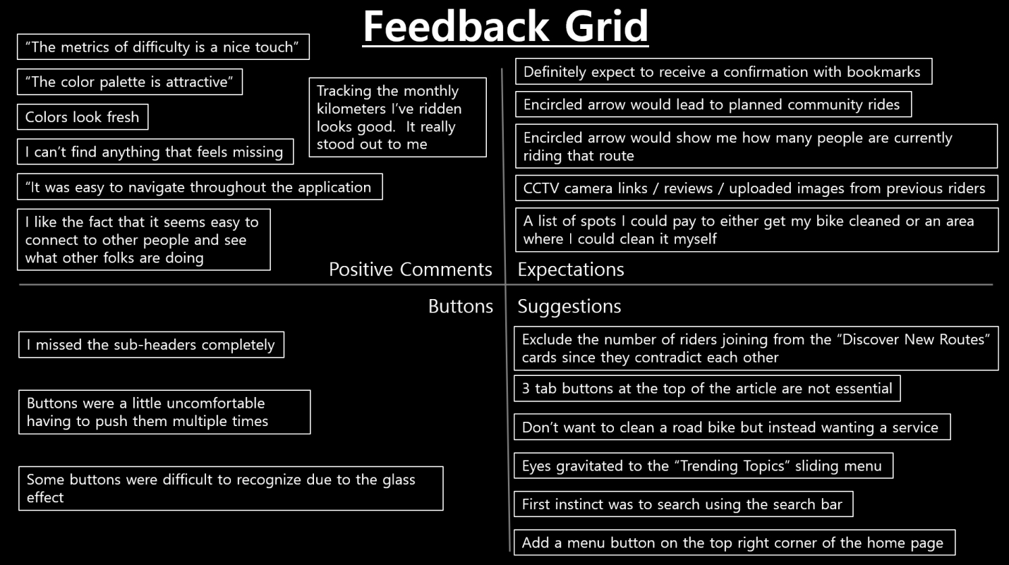
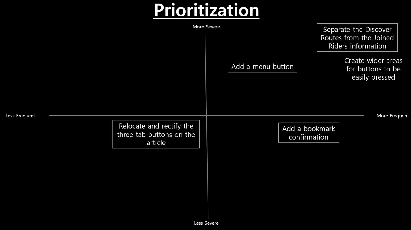
Analysis of data, interviews, and grids revealed key areas for which KorCycle needed to improve.

Usability testing unveiled that the majority of participants instinctively navigated towards the Trending Topics subsection when searching for articles.
Consequently, a color adjustment was introduced to diminish the section’s prominence and redirect attention elsewhere.

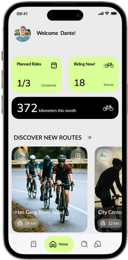
A significant portion of participants during the usability testing phase encountered difficulty clicking the subsection buttons due to their small size and lack of visibility
To address this issue, a color change was implemented to draw users’ attention to each subsection. Additionally, a larger clickable area was provided for enhanced usability

A number of participants expressed the need for confirmation when booking information, prompting the implementation of a color change.
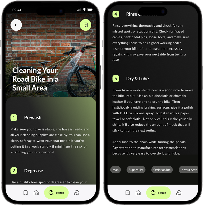
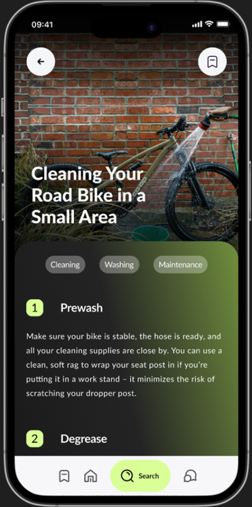
Additionally, during testing, participants found the three tag buttons at the top of the article unclear. A minority also questioned their specific purpose. Consequently, these buttons have been relocated and refined to enhance clarity and intuitiveness, now positioned at the bottom of the page.
REFLECTION
Outcomes
The launch of this website design has been postponed due to time and engineering limitations. However, I maintain regular communication with the owner of Aube Pilates and intend to persist in refining the site designs until we achieve a fully functional website. The owner expressed excitement at the prospect of seeing her ideas materialize and her company’s website come together, enabling her clients to access all online content conveniently in one central location.
If I had more time
Secondary research is imperative at this juncture. I’m eager to collect additional data from a broader audience to more accurately identify missing elements, such as the instructor bios.
MY OTHER PROJECTS
Copyright © 2024 All Rights Reserved . Powered By Nerdzilla Tech